TRULY Campaign
Role: UI/UX Designer (Partnering with Art Direction)
Focus: Immersive Web Experience, Interaction Design, Brand Storytelling
Stockholm, 2021
Focus: Immersive Web Experience, Interaction Design, Brand Storytelling
Stockholm, 2021
Context — A high-profile campaign launch for five new Bolon flooring products.
Challenge — Translate an editorial art direction vision into an interactive web experience that felt immersive without sacrificing product specification.
What I did — Designed a two-part scroll journey: a full-screen narrative phase with spatial transitions and interactive product gadgets, followed by a conventional deep-dive with side-panel specs and a bespoke video player.
Outcome — Launched in 2021 as one of Bolon's most ambitious digital campaign efforts.
About
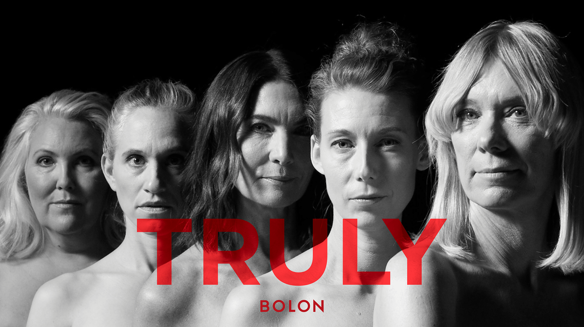
If my main job on Bolon.com was to build a rigorous B2B system, the TRULY Campaign was the exact opposite. This was a high-profile launch for 5 distinct new flooring products. It needed to feel editorial, experimental, and highly visual. I worked side-by-side with the Art Direction to translate their concepts into a tangible, interactive web experience. The goal was making the users want to stay and explore.
_______
The Hook: The Startpage Countdown
To build anticipation before the launch, a temporary homepage takeover was introduced. A looping background video set an editorial tone, while frosted-glass panels kept the countdown legible without obscuring the details in the video. It was also a straightforward prompt to gain more subscribers before the collection dropped.
See the looping countdown startpage hero in the embedded Figma prototype below.
_______
The Mechanics: A Two-Part Journey
To balance the editorial storytelling with actual product specification, the landing page was structured into two distinct phases
1. The Scroll Narrative
The first half of the experience abandoned traditional layouts for a full-screen, scroll-driven narrative. Crucially, the scroll was never "hijacked." The user retained full control of the pacing. Natural scrolling triggered spatial transitions, revealing bold typography and interactive product gadgets layered over the photography.
The first half of the experience abandoned traditional layouts for a full-screen, scroll-driven narrative. Crucially, the scroll was never "hijacked." The user retained full control of the pacing. Natural scrolling triggered spatial transitions, revealing bold typography and interactive product gadgets layered over the photography.
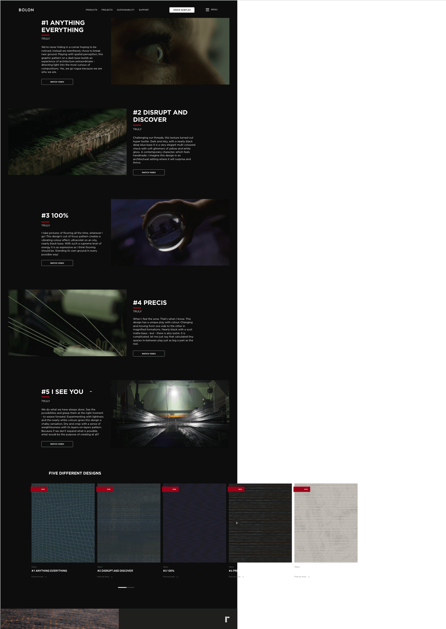
2. The Deep Dive
Once the conceptual narrative was established, the page seamlessly transitioned into a more conventional long-scroll format. The first section immediately introduces the five released products. Each product features an explanatory paragraph paired with a looping video snippet acting as a dynamic thumbnail. Clicking these thumbnails or their respective "Watch Video" CTAs drops the user straight into the bespoke video player experience. Past the video introductions, the page houses the heavier details—interactive product grids, sustainability specs, and macro texture shots.
Once the conceptual narrative was established, the page seamlessly transitioned into a more conventional long-scroll format. The first section immediately introduces the five released products. Each product features an explanatory paragraph paired with a looping video snippet acting as a dynamic thumbnail. Clicking these thumbnails or their respective "Watch Video" CTAs drops the user straight into the bespoke video player experience. Past the video introductions, the page houses the heavier details—interactive product grids, sustainability specs, and macro texture shots.
The desktop screen recording below runs at a steady, continuous scroll to clearly showcase the spatial transitions and the seamless shift from the immersive narrative down into the product discovery grids.
_______
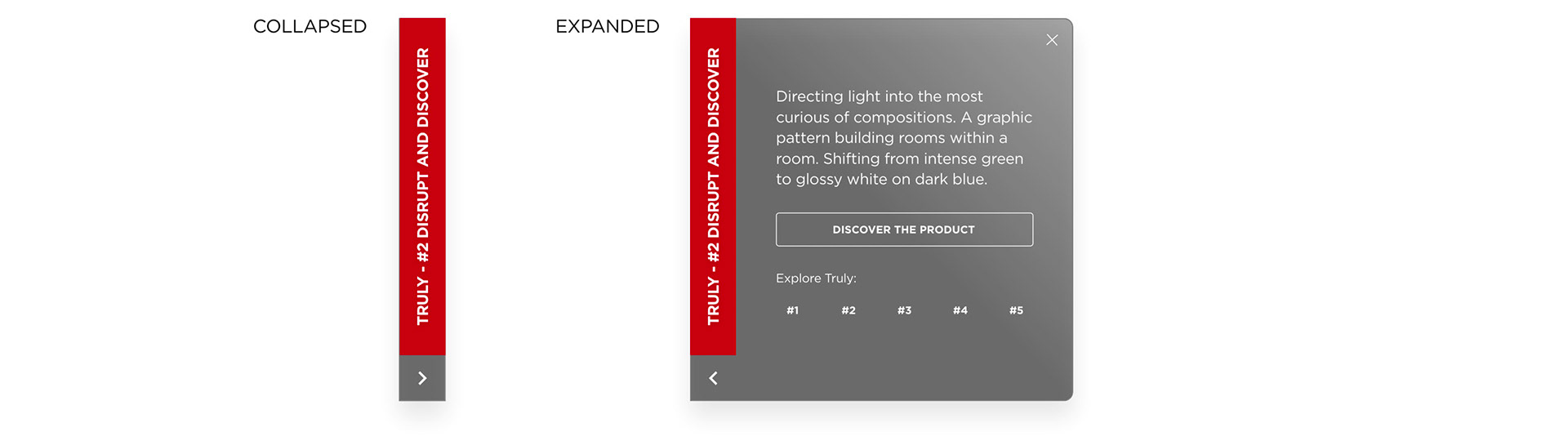
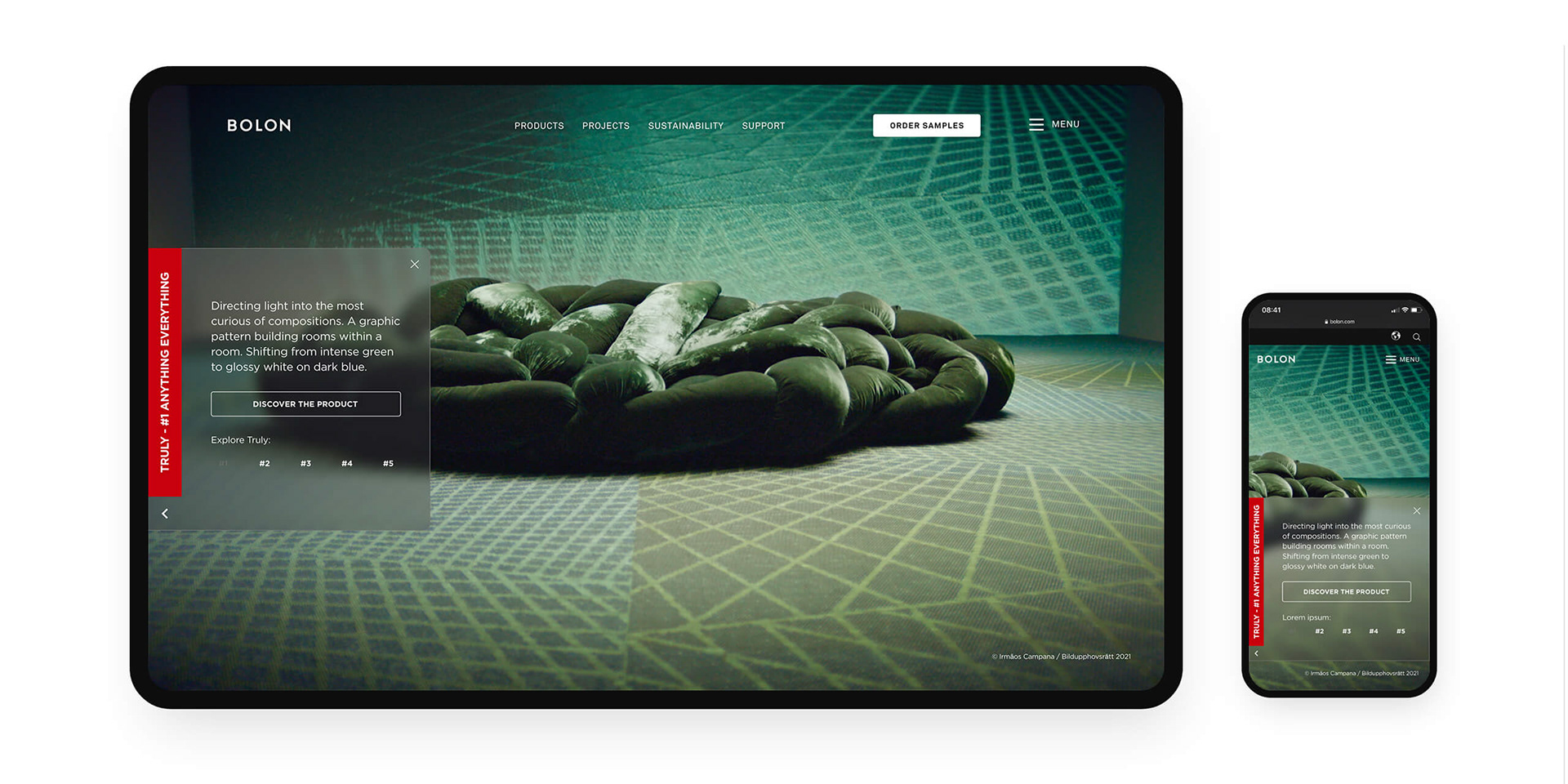
Side-Panel Navigation
To keep the main scroll uncluttered, heavy specifications were tucked into expandable side panels. These slide-out drawers house product details, a clear CTA, and quick-links to jump between the five designs—allowing users to explore deeply without breaking the cinematic flow.
_______
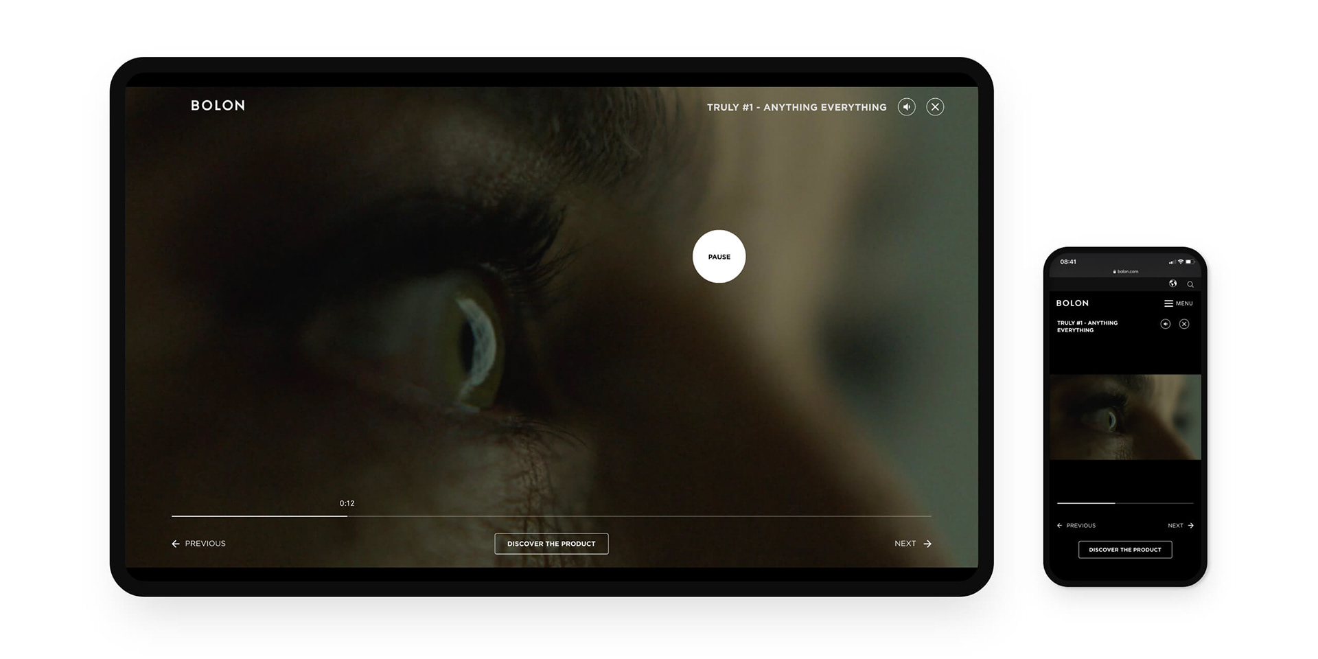
Bespoke Video Player
To maintain the campaign's cinematic immersion, a custom video UI was designed to replace standard embeds. Integrated controls let users seamlessly cycle through all five films, while a built-in CTA connects the video straight to the product.
_______
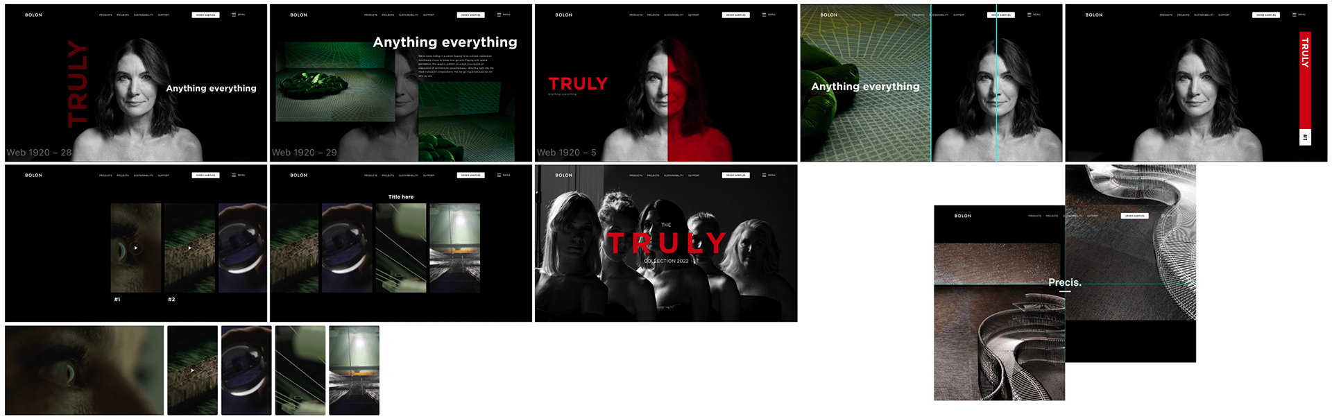
Design Explorations: While ultimately unused, these early concepts showcase different typographic approaches for balancing the bold branding with the photography, as well as experimenting with alternative scroll actions, layered content transitions, and video galleries.
Reflection
If I did it again, I'd push for a clearer brief earlier. The design explorations were useful thinking, but some of that energy could have gone into sharper collaboration with art direction from the start.