The Bolon.com Evolution
(2021–2025)
(2021–2025)
Role: UI/UX designer
Focus: B2B Strategy, Design System, Accessibility, UX Research
Stockholm, 2021-2026
Focus: B2B Strategy, Design System, Accessibility, UX Research
Stockholm, 2021-2026
Context — Lead designer for Bolon.com, the B2B site for a premium Swedish flooring brand
Challenge — Years of freelance patches left the site fragmented and unable to support complex B2B journeys.
What I did — Reframed the site's job around empowering the sales conversation, built Weft — a WCAG 2.1 AA design system — and led a four-year end-to-end redesign.
Outcome — A more usable and accessible site, capable of supporting richer user journeys — with a redesign that earned recognition across the brand's global markets.

Phase 1: The Reality Check (Discovery)
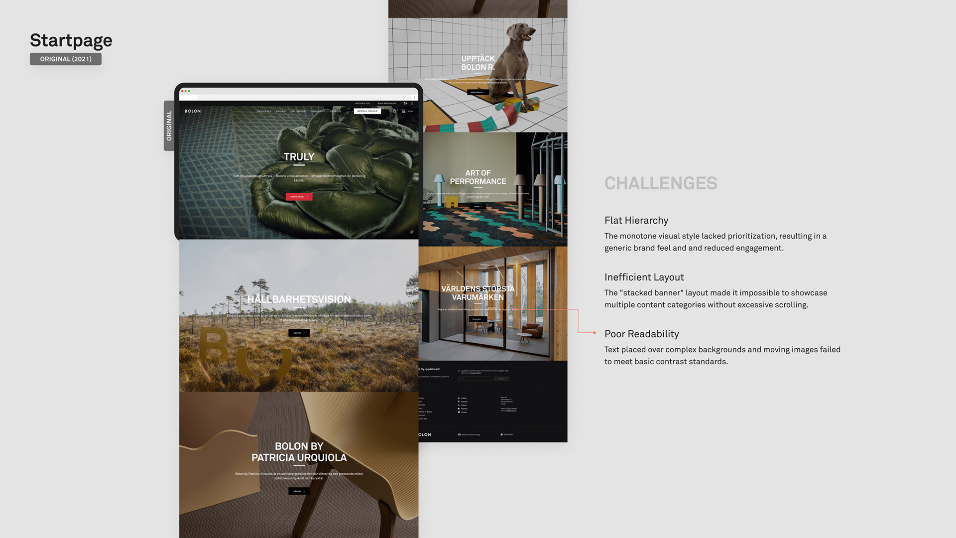
Bolon isn't just a flooring manufacturer; they are a Swedish design institution leading the world in woven vinyl flooring. When I joined in 2021, the brand was premium, but the digital experience was fragmented. Years of using various freelancers had left the site with inconsistent visual hierarchy, oversimplified flows unable to handle complex needs, and a simplicity that wasn't "minimalist," but rather "insufficient." The company realized they couldn't keep patching it up; they needed a dedicated designer to step in and finally take full ownership of the Bolon.com ecosystem.
The insight
The process started with the standard toolkit: Google Analytics. However, it quickly became clear we were in a B2B blind spot.
The Trap:
Bolon sells premium flooring to architects who don’t “check out” online. They order samples (if they don’t already have them) and then speak with sales representatives to close the deal.
The PivotWorkshops Sessions with Owners, Marketing, and Product teams were held to align on a vision and expectations.
I stopped relying solely on data and integrated the Sales team directly into the design loop. Since Sales Reps are on the front lines, they became a primary research source. I consulted them first to identify the specific friction points architects were complaining about.
The goal
The website’s job wasn't to sell the floor; it was to empower the conversation between the Architect and the Sales Representative.
The goal
The website’s job wasn't to sell the floor; it was to empower the conversation between the Architect and the Sales Representative.
_______
Phase 2: The Audit (Definition)
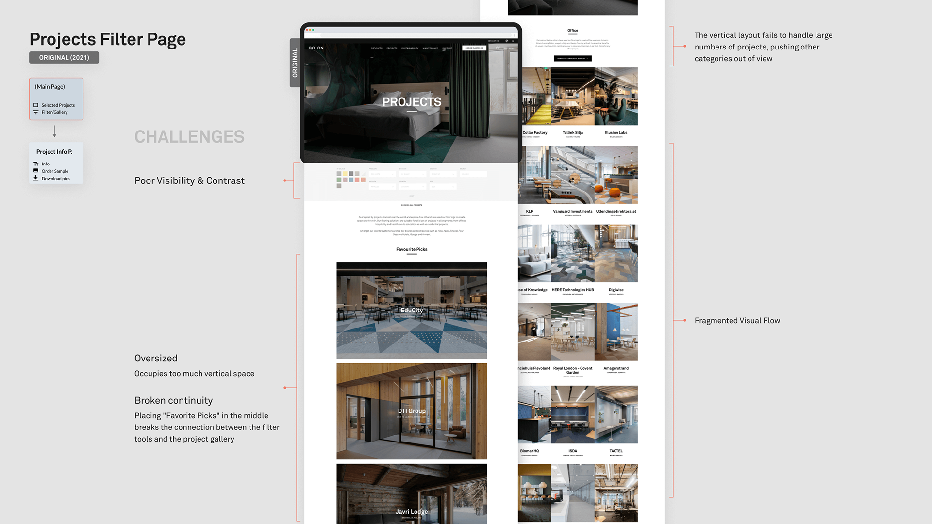
Before building anything new, it was critical to understand the existing landscape. A comprehensive Visual Inventory was conducted to map the current state.
The Diagnosis
I found major inconsistencies in typography, button behaviors, and spacing. The site was struggling to handle complex tasks because every page had been designed in isolation.
I found major inconsistencies in typography, button behaviors, and spacing. The site was struggling to handle complex tasks because every page had been designed in isolation.
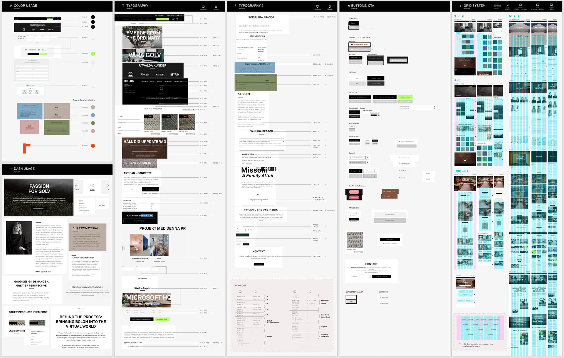
Visual audit of the existing Bolon.com — mapping components, patterns, and one-offs across the site.
The Architecture
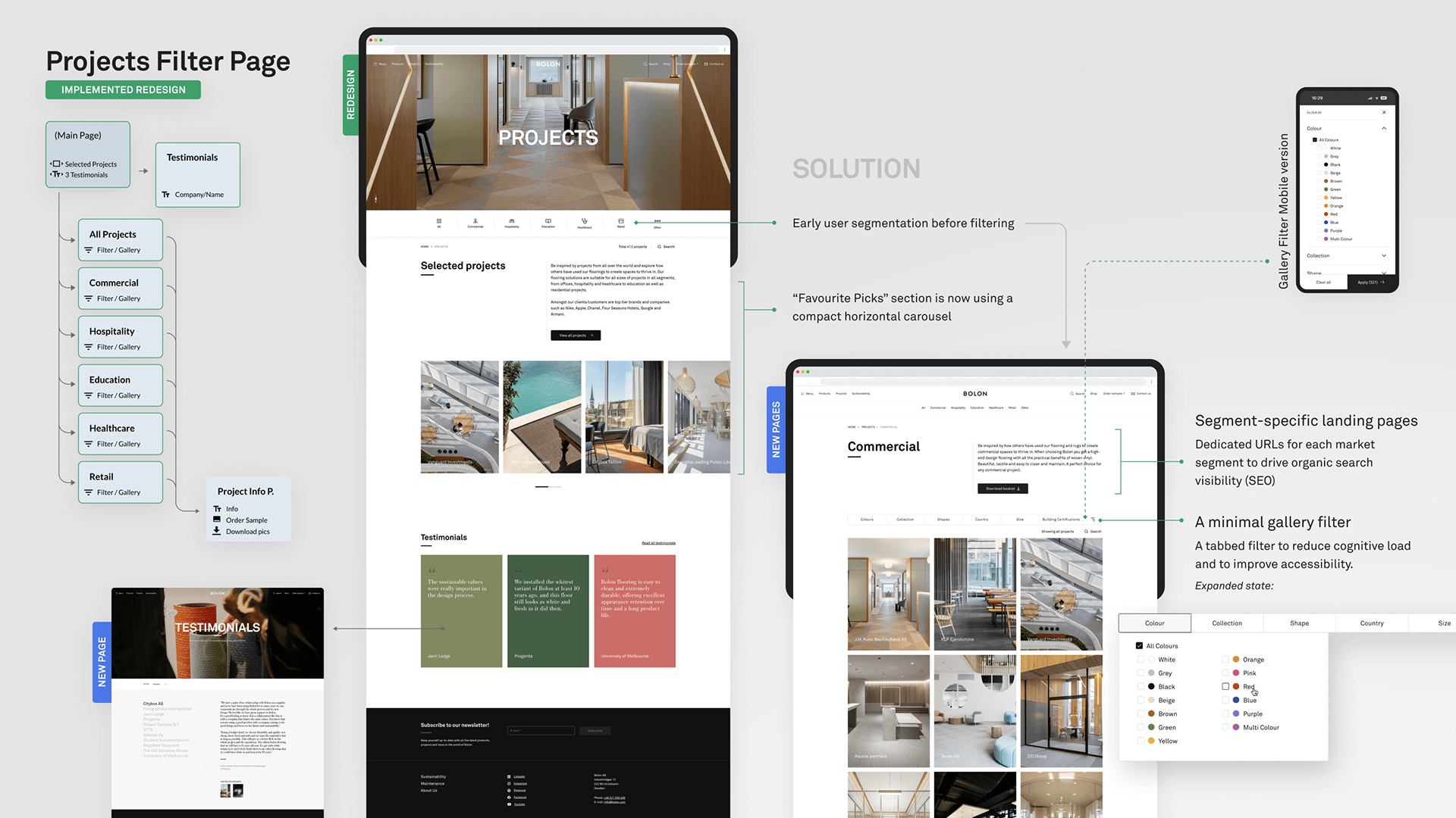
Once the visual chaos was mapped, it was time to tackle the structure. The Information Architecture (IA) was restructured to handle increasing complexity. I mapped out clearer, more robust user flows that mirrored the actual work patterns of a user (Architect, property manager, floor installer, professional cleaner).
Once the visual chaos was mapped, it was time to tackle the structure. The Information Architecture (IA) was restructured to handle increasing complexity. I mapped out clearer, more robust user flows that mirrored the actual work patterns of a user (Architect, property manager, floor installer, professional cleaner).
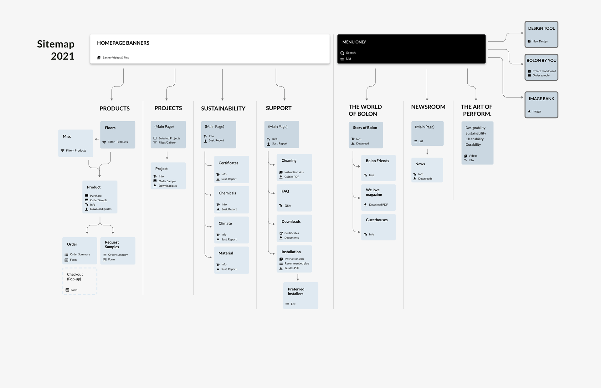
IA Structure when I started working.
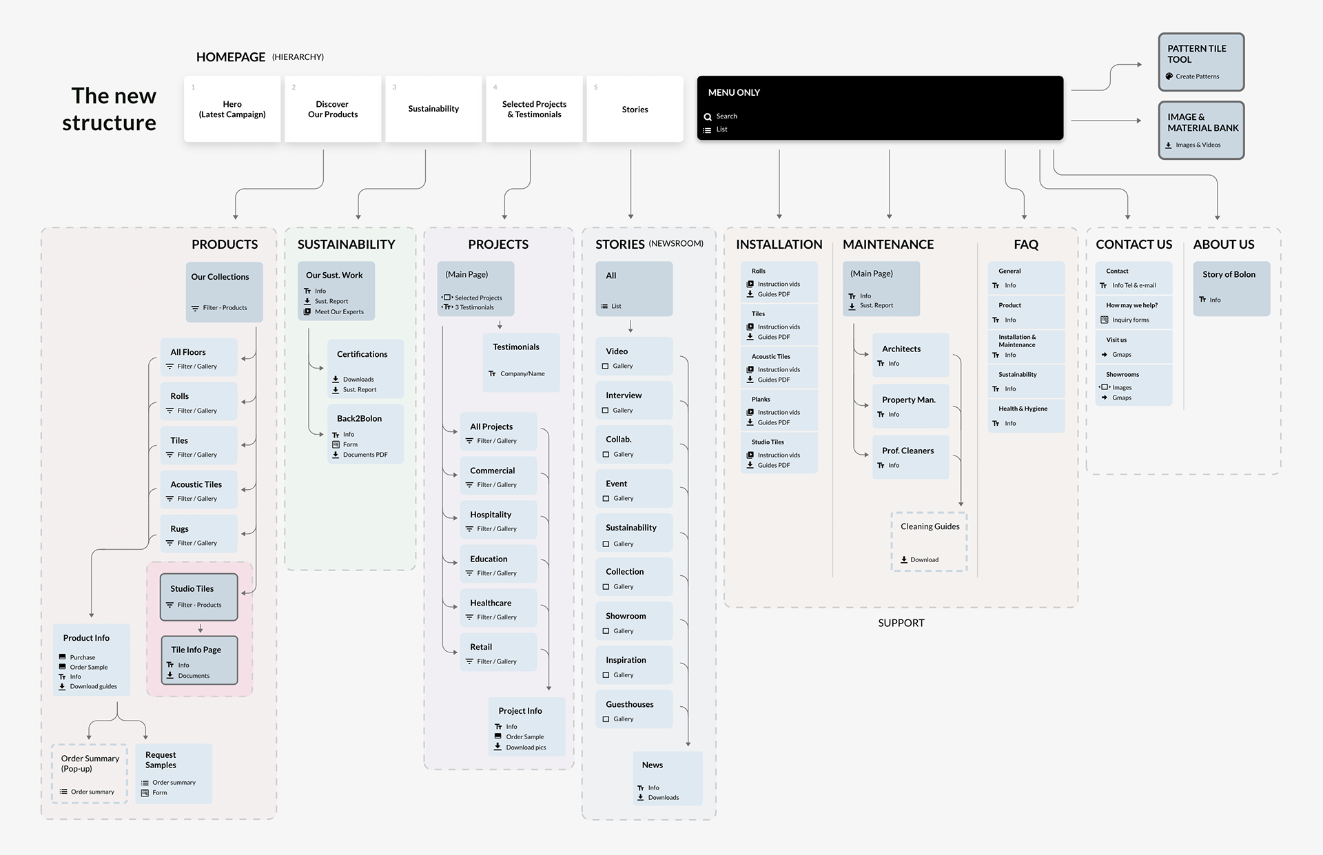
Restructured IA, mapped around four real user types: architects, property managers, installers & professional cleaners.
_______
Phase 3: The Design System "Weft"
This was the pivot point. The platform required a system that could handle without losing the brand's premium character.
Consistency & Modularity
The primary challenge was moving away from ad-hoc styling to a standardized framework. I started to built a modular design system capable of supporting complex functional components—like interactive selectors and dynamic filters—while ensuring a cohesive look across the ecosystem.
The primary challenge was moving away from ad-hoc styling to a standardized framework. I started to built a modular design system capable of supporting complex functional components—like interactive selectors and dynamic filters—while ensuring a cohesive look across the ecosystem.
The Rules
A strict design language was established—typography scales, grid systems, and interaction states.
A strict design language was established—typography scales, grid systems, and interaction states.
Accessibility First
A major focus early on was weaving in accessibility. I wanted to find that balance between a premium aesthetic and true legibility, making sure the final product worked just as well as it looked:
The result met WCAG 2.1 AA standards — contrast ratios, focus states, and all — without ever looking like it was designed by a compliance checklist.
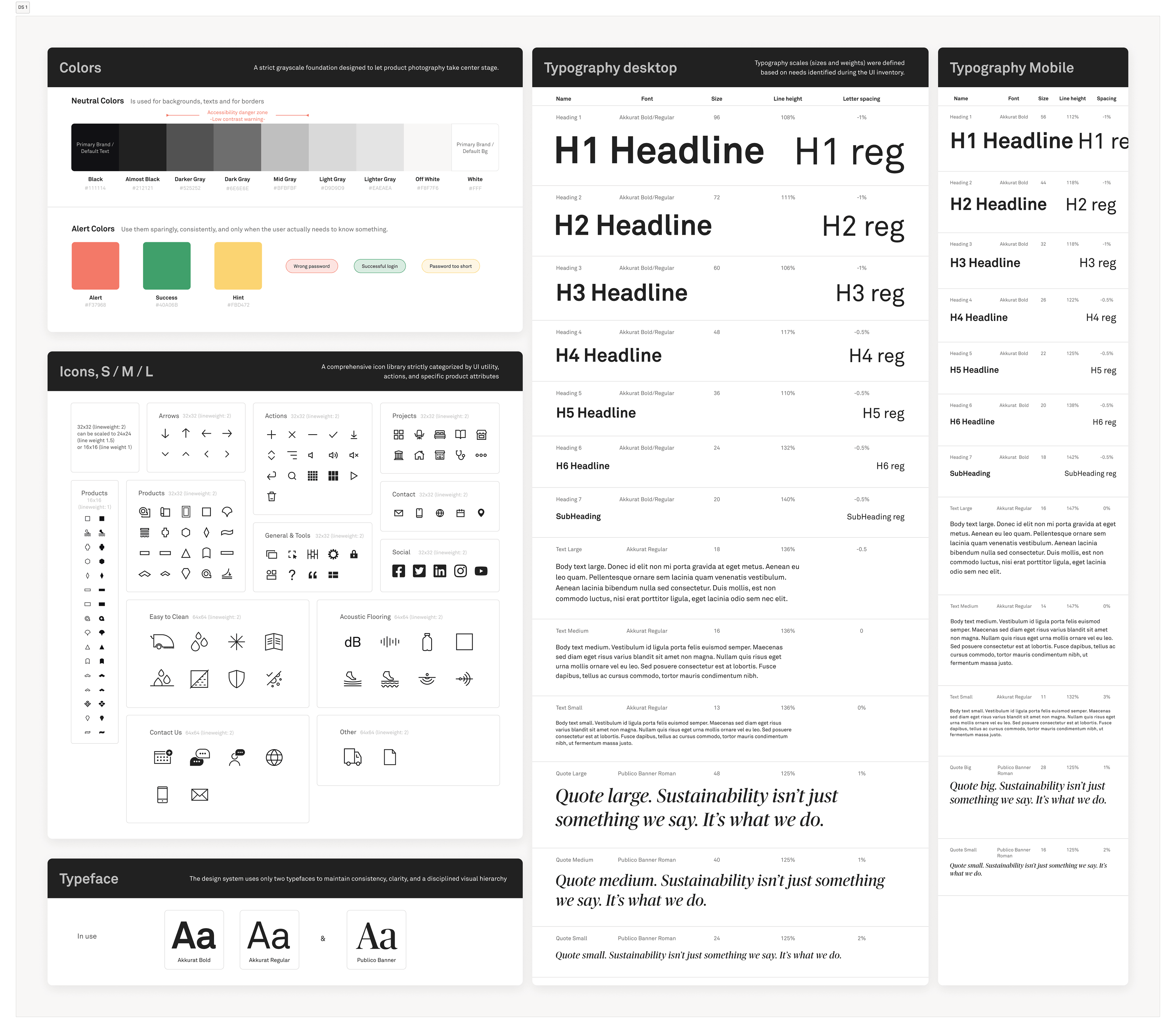
Weft foundations — typography scale, and color tokens built to meet WCAG 2.1 AA without compromising Bolon's character.
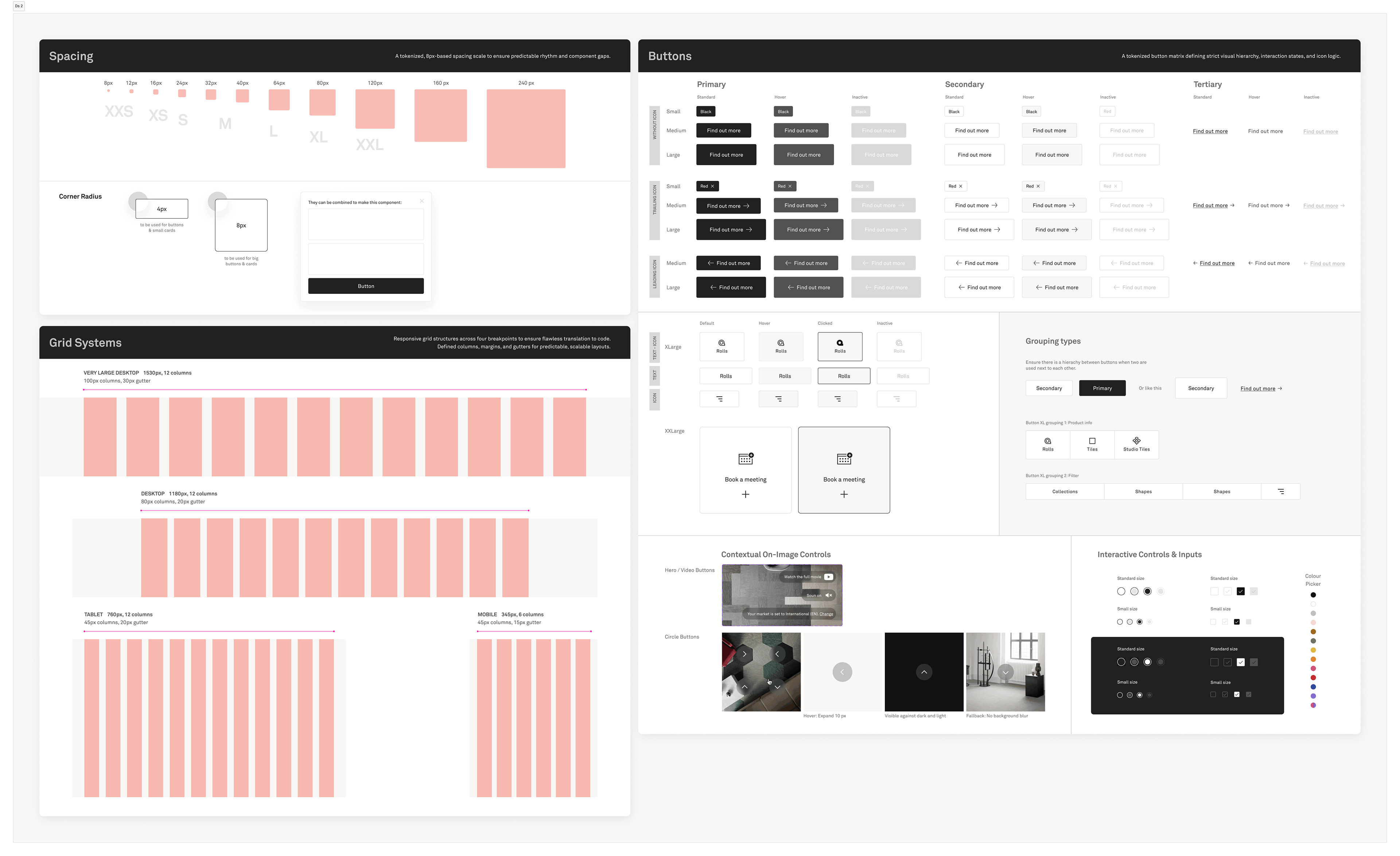
Spacing system and component library in Figma — modular, state-aware, and built to support complex interactive elements like product selectors and filters.
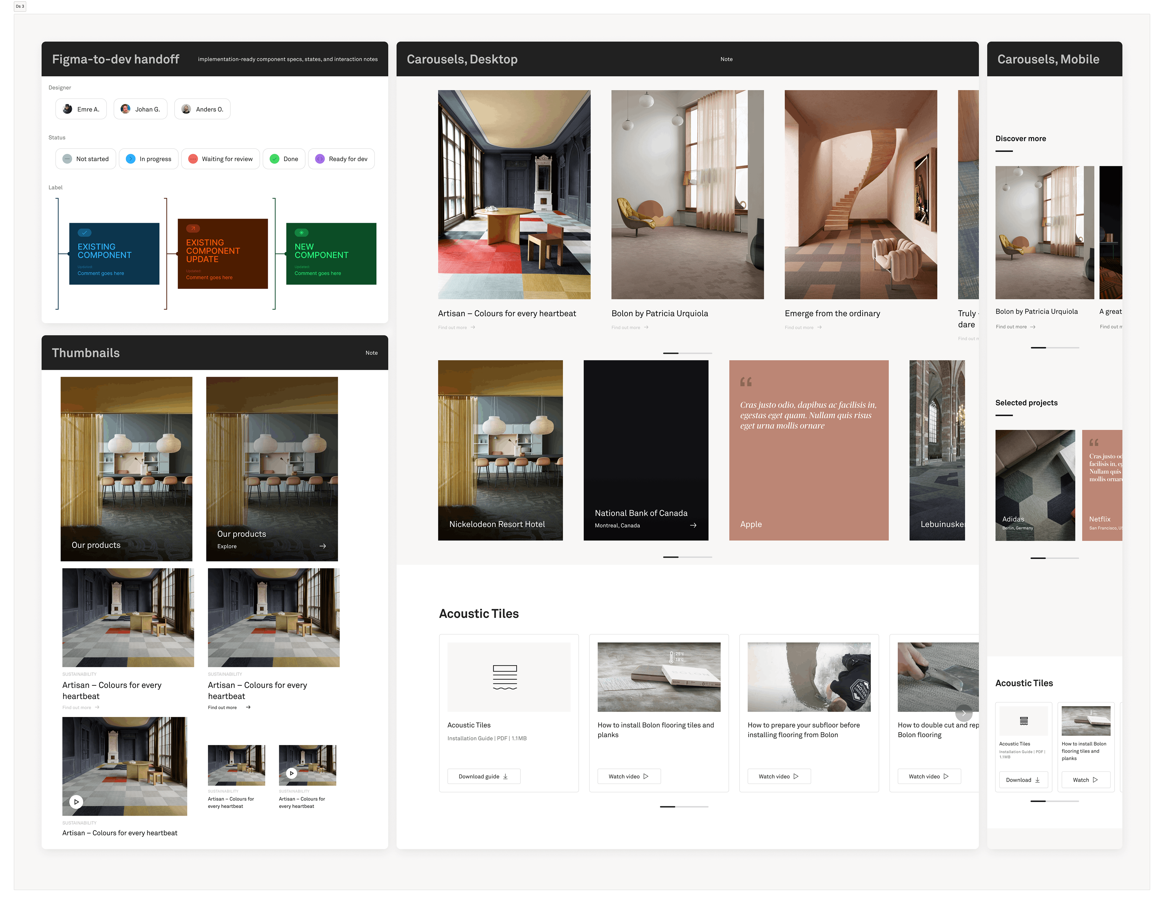
Component variants, statuses, and dev-handoff labels keeping designers and engineers aligned across carousels, thumbnails, and content modules.
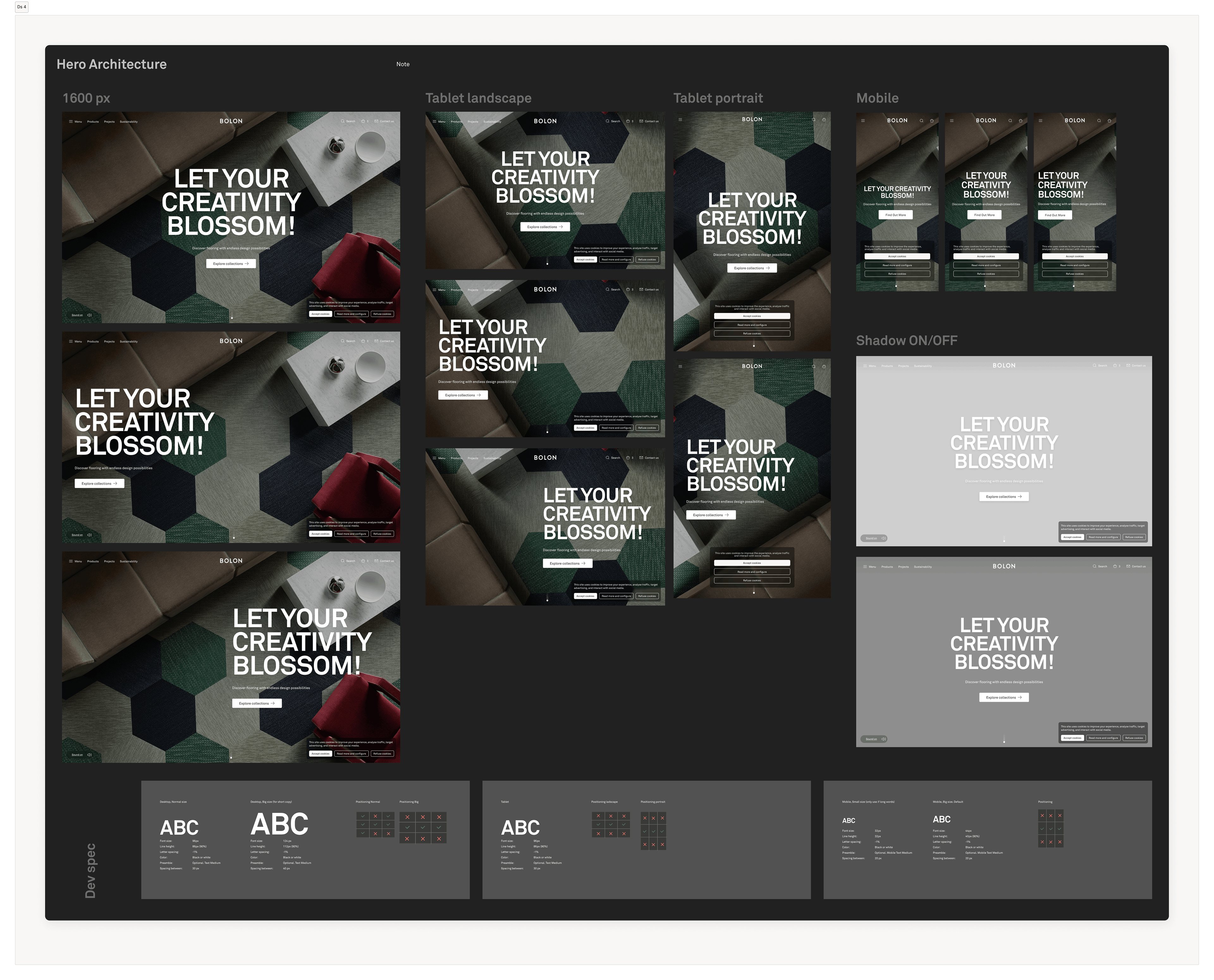
Hero module architecture — explored across desktop, tablet, and mobile breakpoints, with shadow and dev-spec variants documented for engineering handoff.
_______
Phase 4: The Production Loop (Design)
We established a lean, efficient small team structure: a Product Manager, a lead designer (myself), and a part-time designer for support. We streamlined the Figma-to-development handoff and established a cyclical workflow:
1. Investigate
For every new page or feature, I talked to the Sales Reps (our proxy for users) and actual Architects to understand their friction points.
For every new page or feature, I talked to the Sales Reps (our proxy for users) and actual Architects to understand their friction points.
2. Benchmark
We looked at sector standards—not just flooring, but luxury e-commerce—to identify opportunities to improve the experience.
We looked at sector standards—not just flooring, but luxury e-commerce—to identify opportunities to improve the experience.
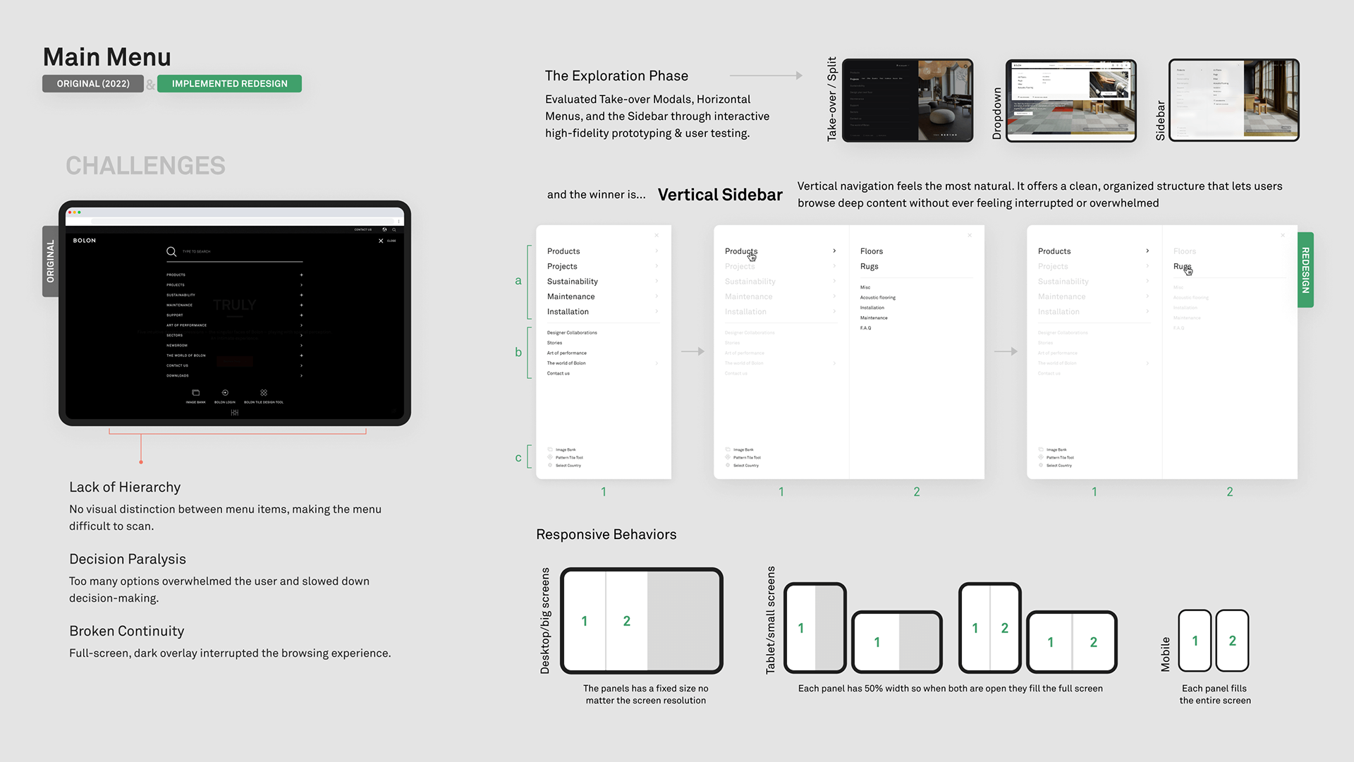
3. Exploration & Alternatives
We moved to clickable prototypes quickly. They were serving as tangible tools to facilitate discussions with the core team, marketing manager, and sometimes the owners. This allowed us to test alternatives and align on the best path before development began.
We moved to clickable prototypes quickly. They were serving as tangible tools to facilitate discussions with the core team, marketing manager, and sometimes the owners. This allowed us to test alternatives and align on the best path before development began.
4. Refine & Handoff
We delivered modular designs to engineering, ensuring they had the logic, states, and assets needed to build it right the first time. Every single page with modules improved the design system along the way.
We delivered modular designs to engineering, ensuring they had the logic, states, and assets needed to build it right the first time. Every single page with modules improved the design system along the way.
_______
Phase 5: The Output (Delivery)
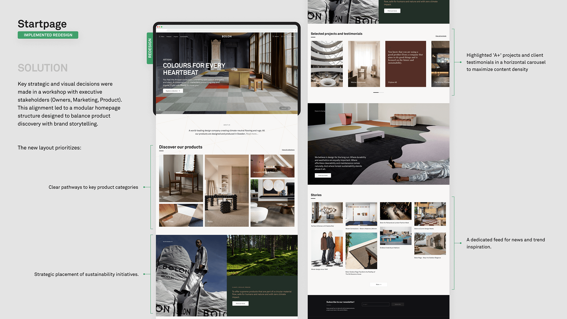
Over four years, the site wasn't just "refreshed"; it was transformed into a strategic sales tool. By implementing a design system and listening to the needs of the field, we bridged the gap between the digital browse and the physical sale.
The following gallery showcases the final implemented designs:
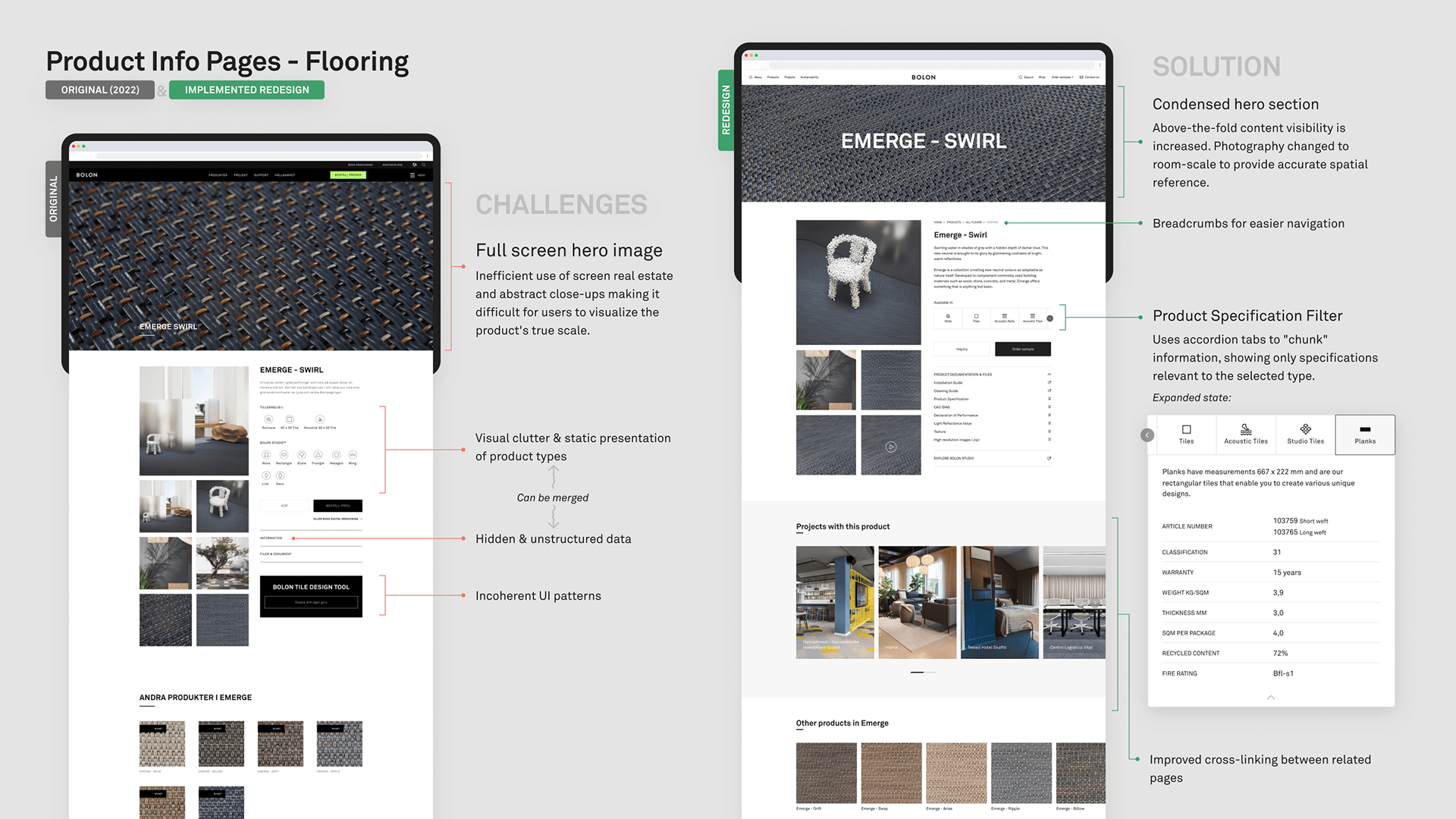
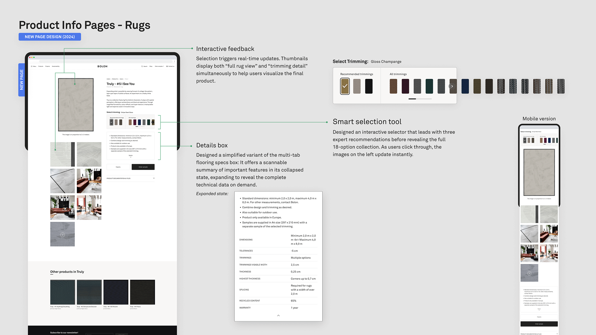
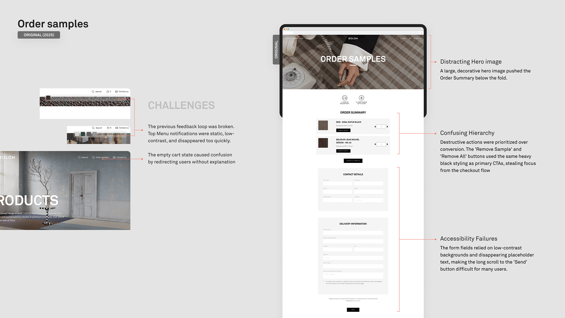
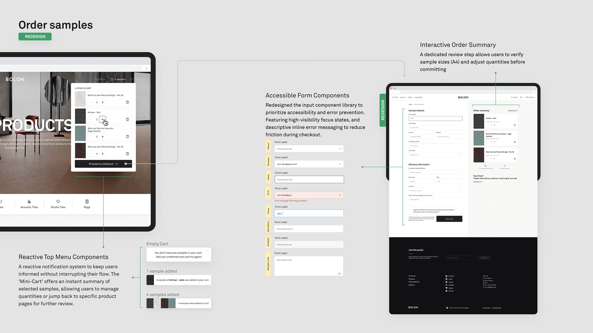
Outcomes & Reflection
Five years in, Bolon.com is calmer and more capable. The fragmentation is gone, architects can move through richer journeys, and the brand finally has a single visual language across the ecosystem. Across global markets — from architects to installers to property owners — the improvements were reported and welcomed.
"Weft" turned design from a bottleneck into an accelerator — new pages start from a shared foundation, accessibility is built in rather than retrofitted, and the system grows without breaking what came before.
What I'd do differently
I'd spend less time on the inventory phase. It was valuable groundwork, but doing it alone pulled energy away from design work I could have started sooner. I'd also push earlier for a proper measurement setup — the qualitative feedback was strong, but harder signals would have sharpened the next round of decisions. And I'd document Weft's why, not just its how, from the start. Design systems live longer when the reasoning is visible.
I'd spend less time on the inventory phase. It was valuable groundwork, but doing it alone pulled energy away from design work I could have started sooner. I'd also push earlier for a proper measurement setup — the qualitative feedback was strong, but harder signals would have sharpened the next round of decisions. And I'd document Weft's why, not just its how, from the start. Design systems live longer when the reasoning is visible.