Bolon Studio™
Role: UI/UX Designer (Partnering with Art Direction)
Focus: Campaign Design, Information Architecture, System Thinking
Stockholm, 2023
Focus: Campaign Design, Information Architecture, System Thinking
Stockholm, 2023
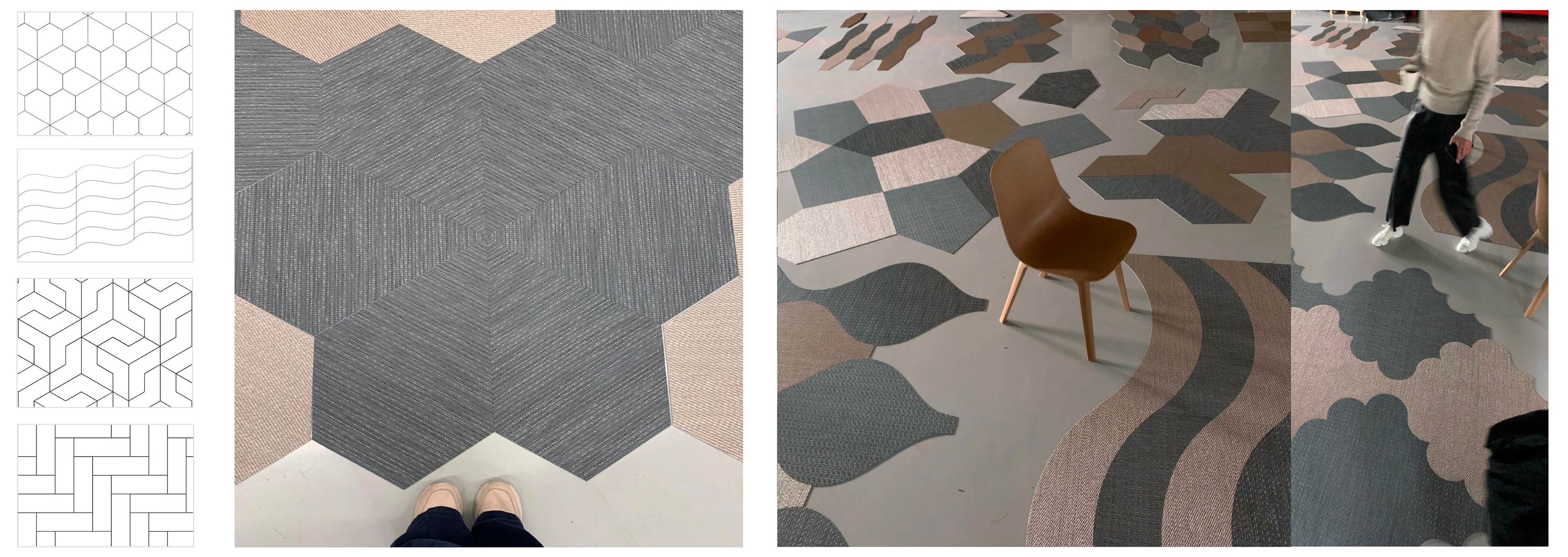
Context — A concept of geometrically shaped floor tiles available across Bolon's full collection.
Challenge — Balance playful with pedagogical, inspirational with technical — for two user types with completely different intent.
What I did — Mapped the ecosystem, defined two distinct journeys, designed the campaign site and a scalable shape page template ×9, connected both to the Pattern Tile Tool as the conversion endpoint.
Outcome — Launched in 2023. The campaign site performed well enough to become a permanent part of the Bolon.com ecosystem.
Brief
Bolon was relaunching Bolon Studio™ — a concept of geometrically shaped floor tiles available in nine forms (eleven today), each orderable across almost the entire Bolon collection. The task was to design a campaign site around the relaunch. What we built ended up staying permanently in Bolon.com ecosystem.
The brief didn’t arrive as a spec. It arrived as a set of open questions from the art director: How do you balance playful and simple? Pedagogical and inspirational? Eccentric versus minimalist? That ambiguity was the starting point, not an obstacle to work around.
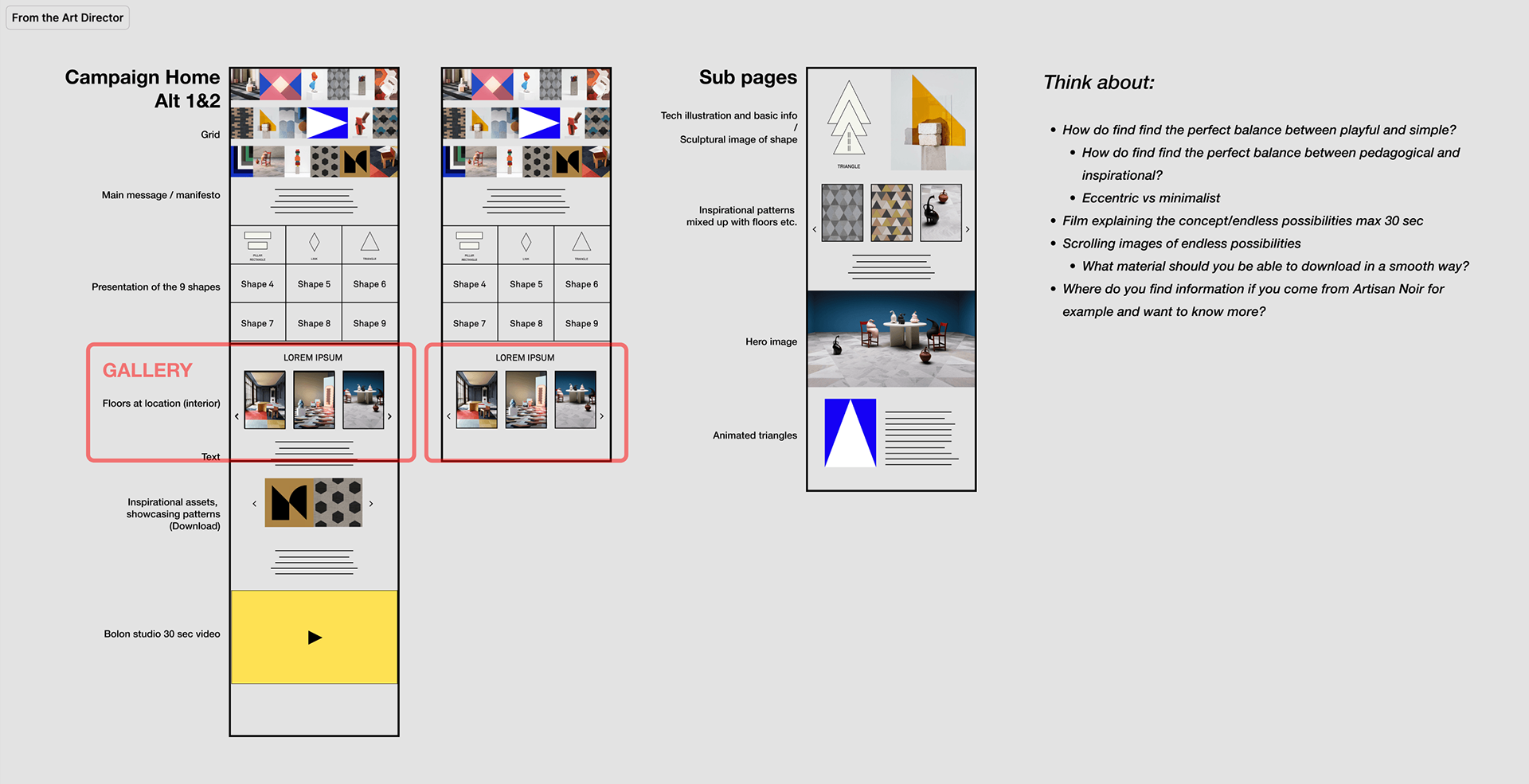
Art director sketch — two homepage alternatives, open questions, sub-page skeleton
_______
The Architecture
Before touching layout, I mapped the full ecosystem. Two distinct user types would arrive with completely different intent.
Paid and social traffic — from Dezeen ads, Instagram, Pinterest — needed inspiration first, information second. Organic traffic and architects already on Bolon.com needed specs, CAD files, and a fast path to a sales inquiry.
Same destination cluster. Two different entry points. Two different jobs to do. And because Bolon Studio™ had nine shapes — each with multiple size variants — the shape page wasn’t a page. It was a template.
All Pages are connected to Pattern Tile Tool — an existing tool where architects could design their own layouts by mixing shapes and collections. A natural endpoint of the inspiration-first journey.
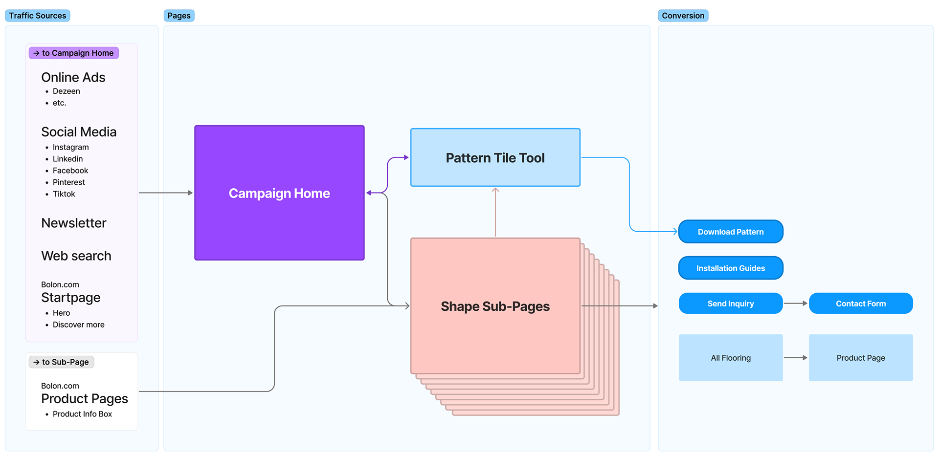
Full ecosystem map — traffic sources, entry points, conversion outcomes
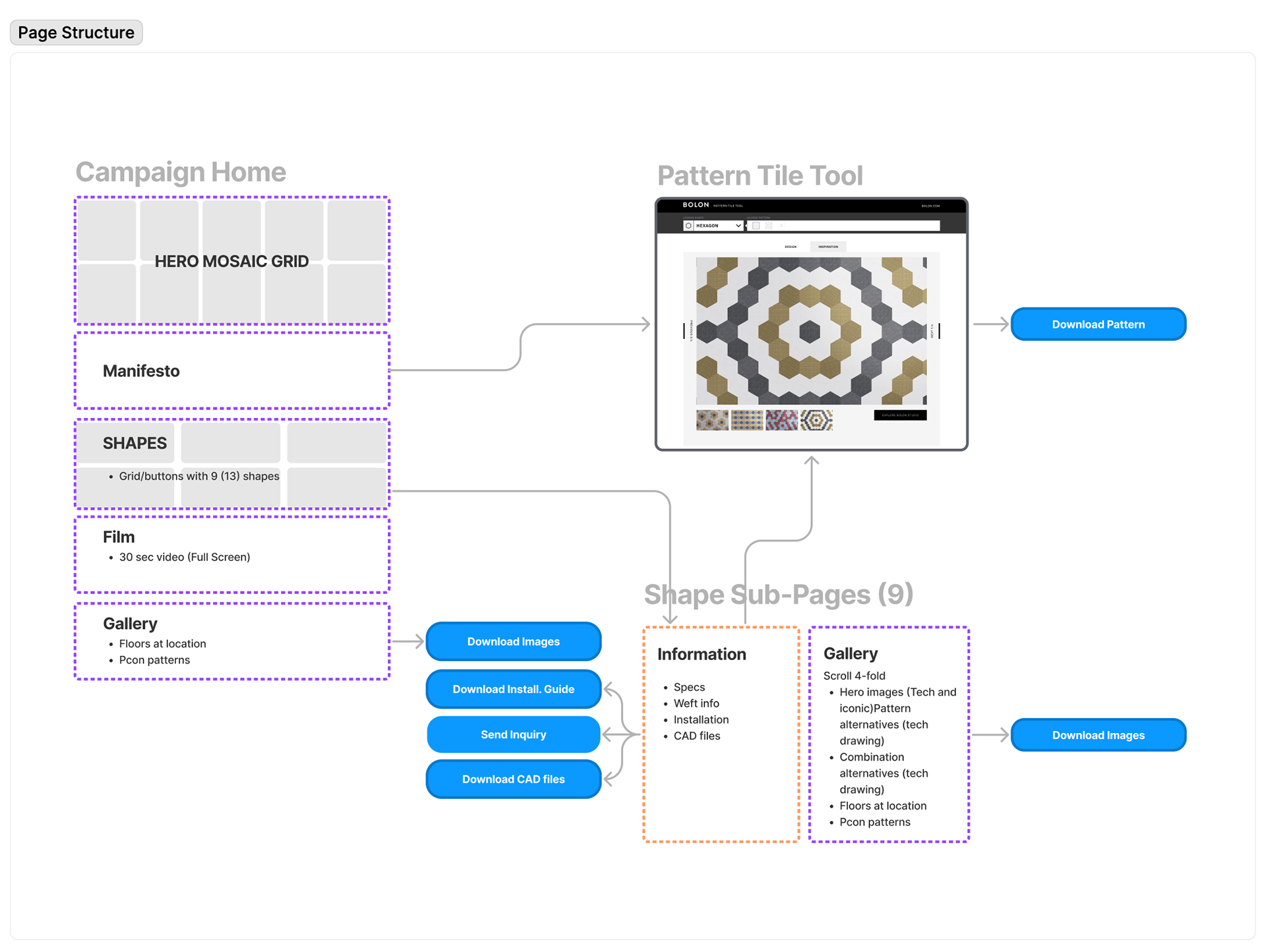
Page structure — campaign page, shape page template ×9, Pattern Tile Tool
_______
Campaign Home (Playful)
The campaign page had one job: make an architect stop scrolling. The mosaic hero grid — mixing photography, pattern close-ups, and sculptural objects — communicates creative range before a single word is read. Below it, the page moves between inspiration and information in deliberate rhythm: manifesto, shape selector, full-screen film, bold typographic banners, gallery. The dark shape selector grid and the gallery are the pivot points — from campaign to the technical shape pages.
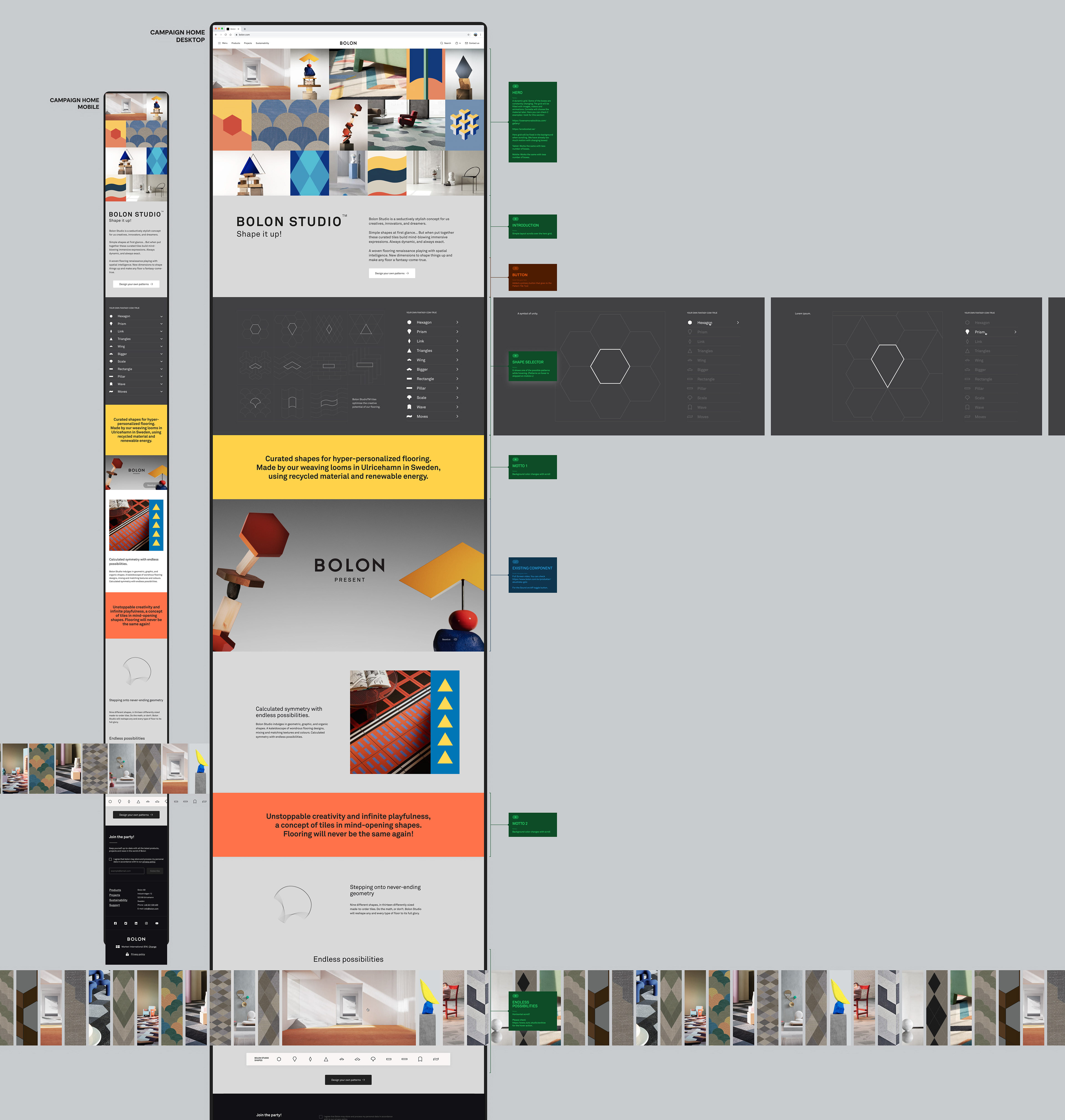
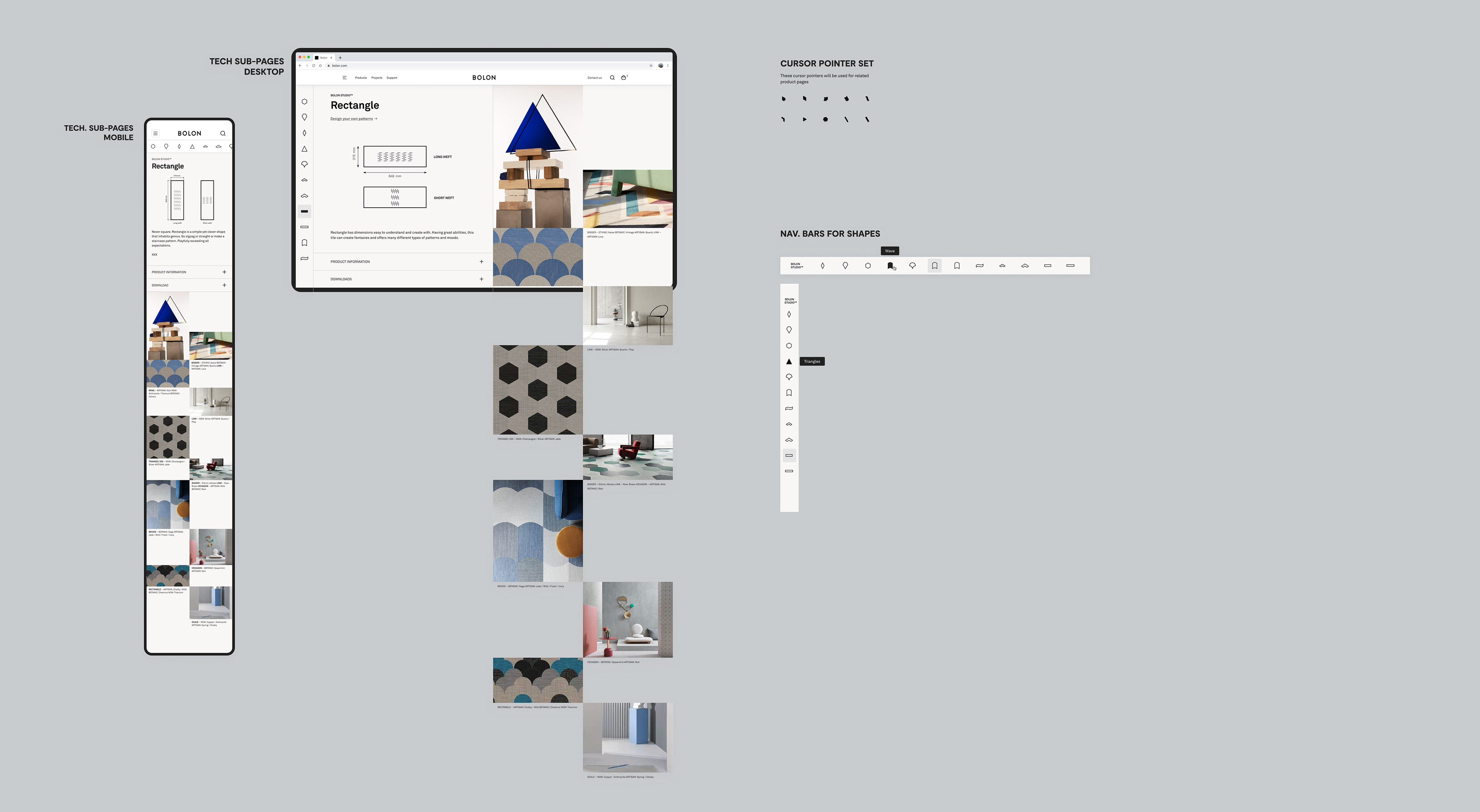
Sub-Pages (Technical)
Once an architect clicks through to a shape, the tone shifts. The shape pages are task-oriented: tech drawing with dimensions, weft direction, product specs, and a mixed gallery showing pattern combinations and real installations. Everything an architect needs to specify a floor.
The navigation bar carries the full shape family as icons, with size variants clearly labelled as text. The custom cursor set and shape icon system were designed to feel native to the Bolon Studio™ world without adding visual noise to a page that needed to stay clean.
Two different pages, two different jobs.
_______
Live Site
Looping mosaic hero grid:
Campaign & shape pages — scroll through:
Live site The campaign launched in 2023: